What Is Colorful Minimalism? |
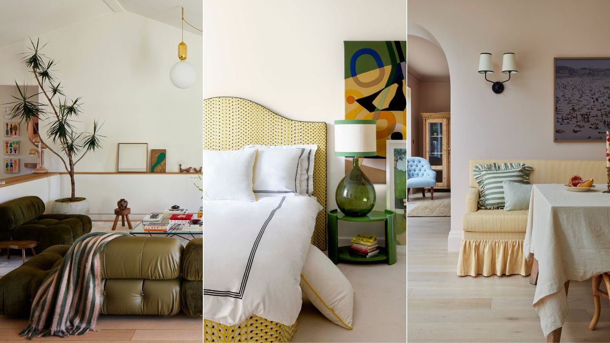
If you find yourself flip-flopping between maximalist and minimalist style, never truly feeling like you belong in either camp, colorful minimalism might be the sweet spot you’ve been looking for.
I can confidently say this because I, too, am a non-committed minimalist with a love of color trends and patterns. I love decorating with neutrals and soft soothing tones, but also crave something a little more vibrant with my decor and don’t particularly relate to the totally pared-back, Scandi-esque interior design styles. Which is where colorful minimalism comes in.
Here, I ask interior designers for their take on this approach to decorating with color to find out why it just… works.
What is Colorful Minimalism?
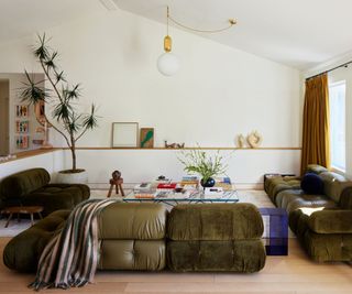
(Image credit: STUDIO KEETA / Photography Ye Rin Mok)
‘Colorful minimalism is a great approach for when you love the tranquility of a neutral space, and yet don’t feel like compromising on color,’ says Kristina Khersonsky, founder of STUDIO KEETA, who perfectly sums up the trend.
‘Our East Side Courtyard House project [seen above] really took shape following this principle – light and bright with punches of intentional color carried through the home whilst also considering elements of form and texture to create a lived-in, layered space.’
And that’s exactly the goal here. Think minimalist decor ideas paired with warmth and color in a way that doesn’t disrupt the calming nature of a laid-back space.
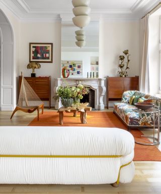
(Image credit: Victoria Maria/Belen Imaz & Pedro Bermejo)
As someone who shies away from bold paint colors, this is a design principle I am really drawn to. I have selected a vast array of off-whites for the walls of my home, from yellow-based to pink-toned and even some soft blue hues. And I intend to apply the rules of colorful minimalism to brighten the spaces up with some needed personality.
‘Colorful minimalism is on the rise, as people don’t want to just stick to the same copesetic look of neutrals all the time,’ explains interior designer Linda Hayslett. ‘So adding a little bit of color in an interesting way, still with a minimal style, is helping people to get comfortable with adding in different hues without feeling overwhelming.’
If you find yourself gravitating towards neutral spaces – with subtle or neutral paint colors on the walls – but you don’t want to stick to an entirely colorless scheme, it is time to give colorful minimalism a try. Here’s how.
How To Be A Colorful Minimalist
1. Ground the space in neutrals
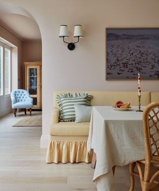
(Image credit: Vaughan Design & Development / Photography Chris Snook)
‘There is a stereotype that colorful interiors are maximalist or visually overstimulating,’ says interior designer Bethany Adams. ‘In my own work, I often employ a rainbow of colors within a single room, but my preference is for quiet, refined spaces – and no one has ever accused me of being a maximalist.’
‘The trick, I’ve found, is to ground a colorful room within an envelope of quiet neutrals,’ she advises. Now this doesn’t have to be stark, trade white walls and light wood flooring. You can work with a palette of hushed tones that allow you to dip your toe into working with color, like the pastel pink walls seen in the breakfast nook above.
‘Diana Vreelands very famously said, “The eye has to travel,” to which I respond “The eye has to rest.” No one loves color more than I do, but without a soft landing spot for your eyes to recover, it all becomes a sensory overload that is enjoyable to absolutely no one,’ adds Bethany.
2. Use furnishings and decor to introduce color
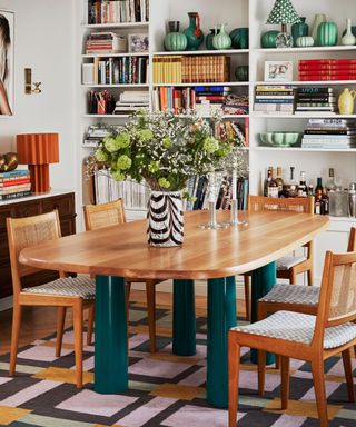
(Image credit: Cathy Nordström / Photography Fanny Radvik)
Of course, the next logical step is to start introducing color. The best way to do this is to start from the ground up – bring in a rug, then larger furniture pieces, and finally work your way up to the smaller details like decorative accents, lighting, and textiles.
Take the small dining room above, for example. The walls are kept clean with white minimal bookshelves but the styling and furnishing bring all the personality.
‘Minimal doesn’t have to mean boring – or by any means all beige,’ says Christine Carney, director of design for Blackberry Farm Design. ‘A more minimal space is the perfect spot for a burst of color. It excites the eye and helps give an area of focus to the room. This is especially true of art in a minimal environment – there is no such thing as too much color.’
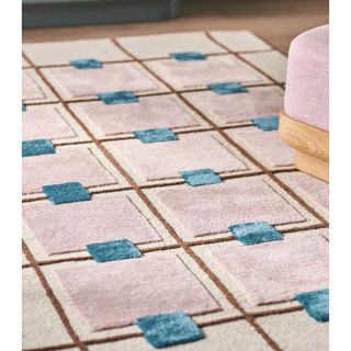
This tufted rug is lovely and thick for a soft and luxurious feel underfoot. The toffee and turquoise hues are softened with geometric lilac squares on a neutral backdrop.
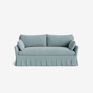
Skirted furniture is a huge trend this year, so this Portola sofa from Lulu & Georgia will make for a statement purchase. You can choose from 31 different fabrics and colors, including this Sky Blue Classic Velvet.
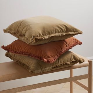
Soho Home Margeaux Set of Three Fringed Cotton-Blend Velvet Pillows
A set of 3 fall ready pillows from the iconic Soho Home brand? Yes please! They will add soft and subtle color to a neutral couch or bedding.
3. Don’t get caught up in matchy-matchy color combos
(Image credit: STUDIO KEETA / Photography Ye Rin Mok)
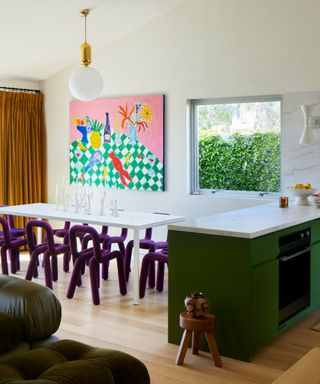
Typically when talking about adding pops of color, the general advice is to keep almost everything neutral and then add in a few bursts of color in a strict color palette.
Kristina of STUDIO KEETA, however, suggests you take a different approach. This makes sense, as colorful minimalism encourages you to lean further into the color wheel than just a few accents of unexpected red or blue.
‘The key to colorful minimalism is not to necessarily repeat the same 3 color combinations throughout (contrary to the popular but slightly dated design tips) but to instead incorporate tones that spark joy,’ she explains.
‘Don’t worry too much if the colors pair well,’ Kristina says, advising you to throw caution to the wind with clashing colors. ‘Do, however, make sure the color shows up at least twice in the same space. Sometimes the most absurd-feeling color pairing brings out the biggest impact in the space.’
4. Consider your undertones

(Image credit: Victoria-Maria/Belen Imaz et Pedro Bermejo)
‘To achieve a good balance, look to the undertones of the colors you’re choosing in a space,’ suggests Linda of LH.Designs.
This is particularly important if you’re still keen to maintain the serene and soothing nature of a minimal space. The undertone of a color is what you want to pay close attention to when ensuring any colors you’re introducing into the space will sit together in harmony. Undertones are not always readily apparent until they are paired with other colors, or under certain lighting.
‘If you have a lot of neutrals that have yellow undertones in them, then that’s a color to look at to add into a space. Additionally, some pretty color combinations are chocolate browns, tans, and plum. Or oranges, ivory, and warm grays can be fun color combos that help push the minimal envelope but not make it feel too over the top,’ she suggests.
‘There’s no reason that minimalism needs to be monochrome or muted,’ adds designer Kathy Kuo. ‘Just the opposite, in fact – minimalism is about restraint, clean lines, and focused design, and color palettes of any kind can easily fit right in.’
As Kathy explains, with this aesthetic you can still embrace a tranquil, minimalist style while welcoming color and pattern into your spaces without it feeling too overwhelming. Colorful minimalism is an interior design style that truly offers the best of both worlds.
link


:max_bytes(150000):strip_icc()/LeahOC-531cb9a29fd548d3a7a1bdcda7ba4bc1.png)


