A Charming Victorian Puts the ‘Unexpected Red’ Theory to the Test

The interior designer Tommy Smythe was thrilled when a young Toronto couple asked him to renovate their 1880s row house and fill it with vibrant color. But he was also a little bit hesitant. “ ‘We love color’ is something that I hear from clients often, but they are rarely serious,” Smythe observes. “Two red pillows in an otherwise neutral environment is often what they really want.”
But the homeowner, Katherine Konn, and her husband really did seem to mean it. “We don’t like to hold back,” says Konn, a graphic designer. “We lean into the bold.”
So Smythe embarked on an experiment. “I suggested a red dining room right out of the gate,” says the designer, who then waited for a reaction. “They responded, ‘Sounds perfect,’ without hesitation,” he says.
Smythe was off and running, paint and fabric swatches akimbo.
Certainly, they had come to the right place. Smythe, a partner in TOM Interior Design Studio and a television personality in Canada, is known for creating interiors that are livable but also infused with playfulness and a sense of style (he also designs stores for the women’s wear label Smythe, co-founded by his sister Christie). True to form, he set the tone for this vibrant project right at the front door. It’s painted red, of course, and leads to a vestibule where the ceiling and top of the walls are covered in a bold ikat grass cloth, above paneled walls hung with Victorian coat hooks painted turquoise. The floor was retiled in an English-inspired scheme of black-and-white tile placed in a diamond pattern; it was extended into the entry hall, where the stairs are covered in a striped runner that Smythe found in a basket at his favorite antiques shop, the Door Store. “It was only a couple of hundred dollars and has so much personality,” Smythe says.
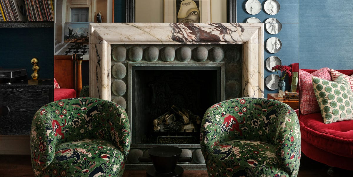
The color story continues into the living room, where visitors are greeted by a palette of rich mid-tone blues, greens, and magenta. “The effect is of a soft, shadowy, moody space at night, but it’s bright and exuberant in the daytime,” says Smythe, who collaborated with his TOM colleague Colin Baird on the project. “It changes with the seasons and times of day because the colors are right in the middle—bright but not too bright, dark but not too dark.”
The couple loves to entertain so the living room, while petite, had to have plenty of seating. To make the most of the space, the designers placed a custom banquette opposite an antique French Empire daybed. That left room for four additional chairs: “two contemporary ones, huggy and comfy, and two more-formal period Louis XVI armchairs,” he notes. A large fireplace “takes up a lot of space but was at the very top of the clients’ wish list, so I had the whole thing mirrored to help it disappear.”
Gutsy color choices abound in the project, from the pink and green kitchen to the home office, where a pink Parsons table and red-and-white zigzag rug pop against chocolate brown walls. Another subtle touch are the ceilings, most of which have been painted a pale pink (Farrow & Ball’s Pink Ground). “My mother always had them, and I observed from an early age that they are soft and flattering and lovely,” Smythe says of the design choice.
In a home filled with color statements, the dining room—with its crimson walls framed in moldings painted a deeper shade of red—stands out as one of the boldest. Rather than hold back, Smythe piled on the glamour, adding a Murano pendant, a Biedermeier bar, and 18th-century Italian dining chairs covered in a multihued jacquard. It’s a showpiece and a feast for the eyes, like every room in this vivacious house. “All the colors, pattern, and textures make it such a happy place, especially during Toronto’s winters,” Konn says. “Even if it’s gray outside, I come inside to so much color and warmth.”
Ingrid Abramovitch, the Executive Editor at ELLE Decor, writes about design, architecture, renovation, and lifestyle, and is the author of several books on design including Restoring a House in the City.
link


:max_bytes(150000):strip_icc()/LeahOC-531cb9a29fd548d3a7a1bdcda7ba4bc1.png)


