7 Interior Details That Designers Think Are “Cringe-Worthy”

We know we were taught to never judge a book by its cover, but when it comes to interior design, the stakes are just different. Since every room in your house should evoke a welcoming, mood-boosting energy, crafting a space that looks and feels good is basically half the battle.
At the end of the day, what constitutes a beautiful home is subjective: Some people might favor a classic, traditional design, while others love pared-back modernism. Still, there are some features that always manage to make professional decorators immediately recoil.
“Design is deeply personal, but certain choices can make even the most seasoned designer take pause,” says Sandra Lucas, co-founder of Lucas/Eilers Design Associates. “Ultimately, anything that lacks meaning or purpose has no place in a thoughtfully curated home. That said, the more challenging the starting point, the more rewarding the transformation!”
These design icks can be as big as matchy-matchy furniture or as nuanced as the temperature of your lightbulb, but they can change the vibe of even the most thoughtfully decorated rooms (and not for the better). To help, a handful of designers are fessing up by sharing the most cringe-worthy items in a home. Once you understand their design icks—and how to avoid them in the first place—you can sidestep the judgement and focus on a creating a home that brings you joy.
A Surplus of Screen Time
We love indulging in our latest streaming obsession as much as the next person, but a television shouldn’t be the focal point of your room. “Everyone who knows me understands my stance on exposed televisions,” Lucas laments. “I believe they should be concealed whenever possible to maintain a cohesive and polished look.”
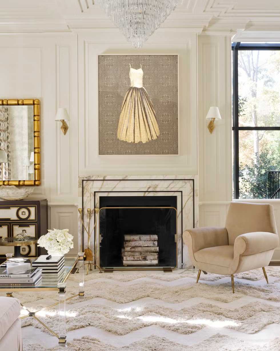
Fortunately, there are plenty of creative ways to conceal a television. While some designers install sliding panels around them for on-demand movie nights, others add decorative frames along the perimeter to help their screens blend in or purchase TVs meant to look like framed art. Meanwhile, this Atlanta home makes a case for trading in your television for a focal piece of art.
Overly Matchy Furniture
Though buying a furniture set might be an easy (and sometimes affordable) way to furnish your room, Sarah Eilers says it does your decor zero favors. “A home’s character comes to life through a thoughtfully curated mix of pieces that tell a story, rather than a perfectly matched furniture set that feels lifted from a showroom,” explains the Lucas/Eilers Design Associates co-founder.
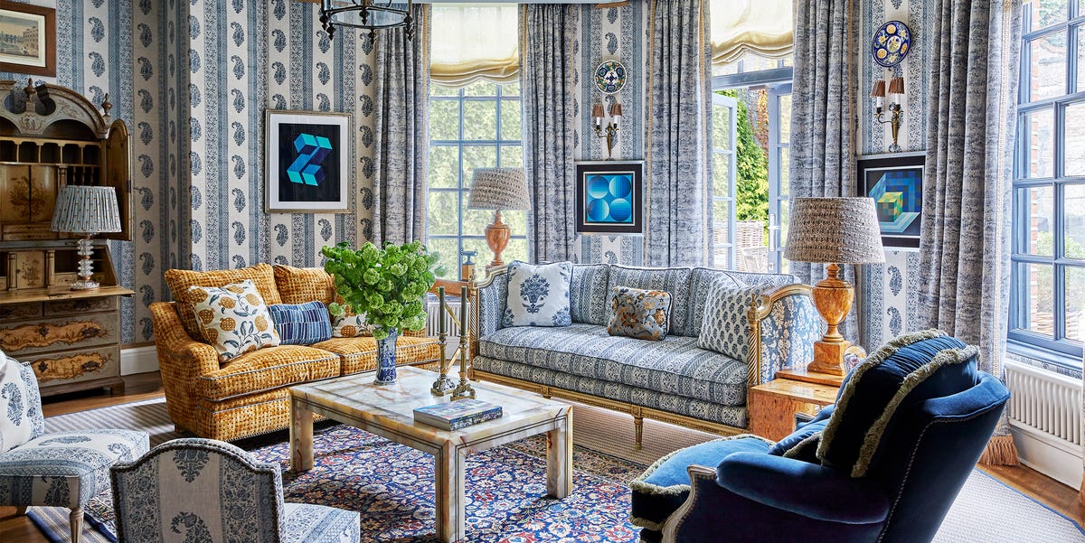
Instead, take your time to build a furniture collection that speaks to the soul of your home. “True beauty lies in the art of layering textures, finishes, and styles to create a space that feels both collected and deeply personal,” she says. With a checkered couch, velvet armchair, and small, ziggy seat, this space from Barrie Benson celebrates the beauty of variety.
Curtain-Free Windows
According to Lauren Lothrop Caron of Studio Laloc in Seattle, homes without window treatments feel unfinished. “It’s like an outfit missing pants and shoes,” she explains. “These elements are essential to a well-designed space.”
Drapery dissidents might give this cringe-worthy moment pause—especially if they don’t want curtains swallowing up their room or budget—but Caron insists they’re worth it. “While they can be an investment, they’re exactly that,” she counters. “Investment pieces that add warmth, texture, and a sense of completion to a home.”
For a setup that blends in, you can always match your drapes to your wallpaper as seen in Mia Reay’s English retreat. Alternatively, sheers can give a barely-there, sun-dappled effect.
Bad Lighting
As far as most design enthusiasts are concerned, lighting can make or break any room of the house. But while multiple light sources are important—Fran Keenan used chandeliers, sconces, and floor lamps to create a layered look in this Hollywood home—the pros are begging you to not overlook the lightbulb itself.
“Cool light bulbs that scream ‘operating room,’ not ‘come in and stay awhile,” says designer Liz Caan. “Go through your house and make sure your bulbs are consistent and have warm temperature. You will feel better—and you will look better.”
Gary McBournie agrees and says typically uses a 2700K LED bulb. “To further enhance things, I use dimmers,” the Boston designer explains. “Another trick I use involves experiments with the materials on shade.” For example, he says parchment, off-white linen, and silk toppers are all fair play.
Disproportionate Rugs
Designer Meghan Jay says proportions are everything—especially when selecting a rug. “It makes me wince when I see furniture hanging off a tiny rug,” the Chicago designer explains. “Rugs should anchor the entire seating arrangement, not just sit under the coffee table or a few legs. She adds that the right rug can completely transform a space, making it feel “more cohesive and inviting.”
So, where to begin? A rug should be large enough for your furniture to fully sit on top of it, but industry insiders say there should be at least six inches of open rug on each side. Let this St. Louis dining room from Brittany Bromley show you how it ‘s done.
Too-Trendy Patterns
Trends might come and go, but more importantly? They should never take center stage in your home. “I cringe when I walk into a home and every single fabric or pattern is one seen all over Instagram,” says Courtnay Tartt Elias of Creative Tonic Design. “We often fall in love with what we see frequently, so I understand why and how someone may love a really popular or iconic fabric, but it feels too ‘keeping up with the Joneses.'”
To make your space feel more stylish—and less showy—Elias says moderation is key. “A little goes a long way here,” the Houston designer recommends. “Work to curate an original mix of unique fabrics to mix with the iconic or popular one you cannot live without!”
Or, if you really want to up the decorating ante, take a cue from this Summer Thornton-designed bedroom and blend patterns with personality.
Mismatched Crown Molding
Just because crown molding is a covetable design detail in historic homes doesn’t mean it suits every space. “A huge trigger for me is when homes have overly elaborate and out-of-context crown molding,” designer Ries Hayes says. “It can feel particularly misplaced in modern high-rises and not in keeping with the rest of the space.”
Ultimately, it’s important to understand the style and scale of your room—and decorate accordingly. Though the New York pied-à-terre pictured above originally featured “heavy, 1990s-style crown molding,” Hayes updated the space to give it a modern edge.
“We removed the ornate crown molding and replaced it with a properly scaled, very simple and modern stepped crown detail,” he explains. “This change cleaned up the elevation and made the ceilings feel taller.”

Kelsey Mulvey is a freelance lifestyle journalist, who covers shopping and deals for Good Housekeeping, Women’s Health, and ELLE Decor, among others. Her hobbies include themed spinning classes, Netflix, and nachos.
link


:max_bytes(150000):strip_icc()/LeahOC-531cb9a29fd548d3a7a1bdcda7ba4bc1.png)


