10 paint colors you won’t regret in 10 years
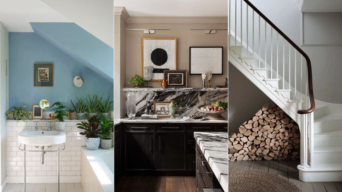
Landing on the right paint color for any interior project can involve much deliberation, and once you’ve found the right shade, you most likely won’t want to have to re-paint any time soon.
And so, when choosing paint colors, it’s worth considering those that boast timeless appeal. Beyond the enduring nature of whites and other neutrals, there are more paint colors branded as timeless than you may first think.
Below, we’ve rounded up ten paint colors that according to designers, will endure for many years to come. Transcending quickly passing trends, these paint ideas will stand you in good stead with timeless room color ideas.
10 paint colors you won’t regret in 10 years
Kittiwake, Farrow & Ball
(Image credit: Farrow & Ball)
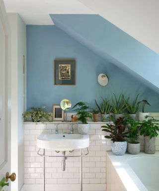
For interior designer Marina Hanisch, Farrow & Ball’s Kittiwake stands out as a timeless paint color, which she describes as a ‘soft steel blue’.
‘This color fosters a sense of calm and tranquility, making it ideal for communal spaces where longevity is key. Its understated elegance and neutrality perfectly complement a variety of textures, materials, accent colors, and patterns, allowing it to transition seamlessly across different design styles. It creates an inviting atmosphere that feels both fresh and enduring,’ says Marina.
Swiss Coffee, Benjamin Moore
(Image credit: Studio McGee)
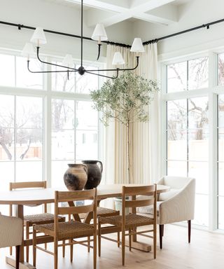
‘You can always count on an elegant, warm neutral paint to stand the test of time and pair well with a number of design styles and color combinations says interior designer Kathy Kuo.
‘I love Swiss Coffee from Benjamin Moore – it’s a warm and inviting off-white with just a touch of green in the undertones so that it’s easy to pair with both warm and cool color schemes,’ adds Kathy.
There are many ways to decorate with Benjamin Moore’s Swiss Coffee, and its warm undertones ensure it doesn’t look at all stark in your home, but instead welcoming and flattering.
Notable Hue, Sherwin-Williams
(Image credit: Curated by Thea, photography Jennifer Cole Rodriguez)
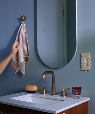
‘My favorite blue paint, hands down, is Sherwin-Williams’ Notable Hue,’ says Thea Bloch-Neal, founder and lead designer at Curated by Thea.
‘It’s the perfect blend of blue and gray – inviting without being overpowering. I’ve used it on ceilings and in smaller spaces, and it always feels just right. It’s timeless and elegant and adds a beautiful pop of color without dominating the room. Trust me, this is a shade you’ll love for years to come,’ says Thea.
Hale Navy, Benjamin Moore
(Image credit: Benjamin Moore)
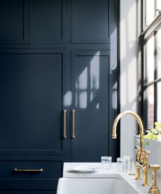
‘Blue paint colors will never go out of style,’ says designer Rosanna Bassford of Memmo Interiors. ‘But not just any blue shade. A classic dark blue like Benjamin Moore’s Hale Navy is timeless.
‘It’s been popular for years and will still be timeless for years to come. It is a dark shade of blue which can read as a neutral in many spaces so it can be used on walls and cabinetry and you won’t tire of it. It’s versatile and pairs well with many other colors but also can make a statement on its own, for example, if you paint an entire room with the color,’ adds Rosanna.
As Rosanna explains, there are plenty of ways to decorate with Benjamin Moore’s Hale Navy, but across kitchen cabinets, as seen here is one of our favorites.
Chantilly Lace, Benjamin Moore
(Image credit: Benjamin Moore)
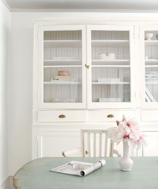
‘One of my favorite colors has been and continues to be Chantilly Lace by Benjamin Moore,’ says designer Nureed Saeed of Nu Interiors. ‘It’s a versatile classic that looks new and fresh every time. I have used this color for clients in both New Jersey and California, so whether it is Eastern sunrises or Western sunsets, it works everywhere. Perfect for any space, I love how Chantilly Lace reads bright yet warm, spacious yet inviting. It is the “Goldilocks” of white paints.’
Chantilly Lace is also a favorite timeless paint color for designer Cheryl Clendenon, owner of In Detail Interiors, who shares:
‘This crisp, clean white is as versatile as it is classic, with just the right balance of warmth and brightness to complement any design style. Its purity allows it to work beautifully with modern and traditional spaces, creating a fresh backdrop that enhances architectural details and pairs seamlessly with changing decor. Whether used on walls, trim, or cabinetry, Chantilly Lace brings an airy elegance that endures, making it a perfect choice for homeowners looking for longevity in their color selection.’
Prussian Blue, Benjamin Moore
(Image credit: Benjamin Moore)
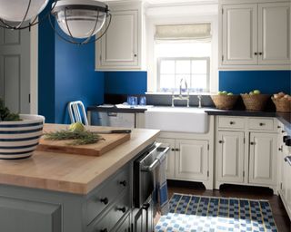
‘I absolutely love Prussian Blue by Benjamin Moore,’ says Chicago-based designer Kristen Ekeland, co-founder of Studio Gild. ‘It’s a color with such a rich history, from its origins in 18th-century Germany to its use in Picasso’s Girl in a Chemise.
‘It’s incredibly versatile – perfect for everything from a powder room to a cozy, moody den. Plus, it reminds me of water and the sea, which has always been my happy place,’ says Kristen.
Cocoon, Sherwin-Williams
(Image credit: Courtesy of Donna Mondi)
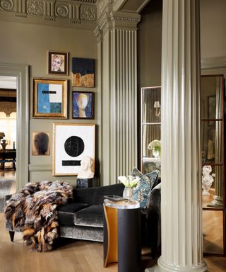
Sherwin-Williams’ Cocoon is another favorite neutral paint that’s versatile to use throughout the home, maintaining appeal for years to come.
‘Cocoon has unexpectedly become one of my favorite timeless colors,’ says Denver-based interior designer Donna Mondi. ‘The website and photos don’t do justice to the true depth of this warm, moody green shade. Use this color to adorn your walls, ceilings, custom millwork and moldings, or even your furniture!’
Shiitake, Sherwin-Williams
(Image credit: Donna Mondi, photography Amy Mazzenga)
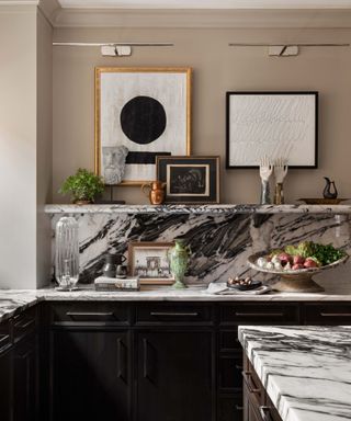
Another paint recommendation from Donna Mondi that you’re bound to love for years to come is Sherwin-Williams’ Shiitake, a warm gray paint.
‘The ideal warm neutral paint color we’ve all been searching for – it will never go out of style! This color is a true chameleon and will perfectly complement your warm wooden cabinetry while capturing the rich tones of exotic stone kitchen countertops. It serves as the perfect backdrop for any style of space,’ says Donna.
Wimborne White, Farrow & Ball
(Image credit: Farrow & Ball)
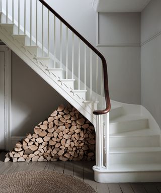
‘Choosing timeless paint colors can help create a classic and versatile foundation for your space that remains stylish for years,’ says Nick Cryer, founder of Berkeley Place, who highlights Farrow & Ball’s Wimborne White as a favorite paint color to withstand the test of time.
The beauty of decorating with shades such as Farrow & Ball’s Wimborne White is that they can work in pretty much any setting and design style, says Nick: ‘Neutral whites provide a clean, bright backdrop that suits any style or decor. They work in both modern and traditional settings, reflect light beautifully, and adapt to changing trends.’
Down Pipe, Farrow & Ball
(Image credit: Farrow & Ball)
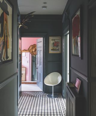
Enduring paint colors don’t have to shy away from making a statement. Dark paints that add drama, such as dark charcoal paints, can feel just as timeless. One such shade recommended by Nick Cryer is Farrow & Ball’s Down Pipe, a popular paint color for making a statement:
‘Dark charcoals add depth and elegance to a space. They make a statement without being overly trendy and pair wonderfully with lighter neutrals and metallic accents.’
While these paint colors boast timeless appeal, paint colors appear differently in different rooms depending on the lighting. As such, Nick Cryer recommends testing them out first to ensure the right fit for your home: ‘Paint swatches on your walls to see how the colors look under different lighting.’
link

:max_bytes(150000):strip_icc()/LeahOC-531cb9a29fd548d3a7a1bdcda7ba4bc1.png)


